Specialty Coffee
Packaging
Created: Kavos Draugas
Head of project: Ieva Bivainienė
Project manager: Indrė Kupčinskaitė Mikulė
Copywriters: Ieva Poniškaitytė, Austėja Ginotytė
Copywriters: Ieva Poniškaitytė, Austėja Ginotytė
Packaging designers: Eglė Chadaravičiūtė, Kęstutis Nenartavičius
Photographer: Rimvydas Chmieliauskas
Photoshoot stylist: Agnė Tamašauskaitė
Printing manufacturing: Immer Digital
⇂
‹ TASK & SITUATION
For almost 10 years now, Coffee Mate Group has the vision to make all the best moments flavoured with fresh, high-quality coffee. In order to improve the use of packaging while emphasizing the authenticity, quality and unique taste of specialty coffee beans, Coffee Mate Group renewed the packaging.
While redesigning the packaging, it was significant to separate different types of Coffee Mate Group’s coffee – specialty coffee, single origin coffee, and limited edition coffee. Moreover, the old packaging did not match the brand image of Coffee Mate Group, and it did not meet the changing design trends and customers’ needs. Also, it was impractical and not eye-catching while positioned on store shelves.
The old design of the packaging was misleading customers, making it difficult to distinguish between different types of coffee beans. Therefore, the idea of the new packaging was to combine modern design with convenience, and to make each package different from each other, but maintain the same style of the line, so that customers could easily choose their favourite coffee beans.
‹ SOLUTION
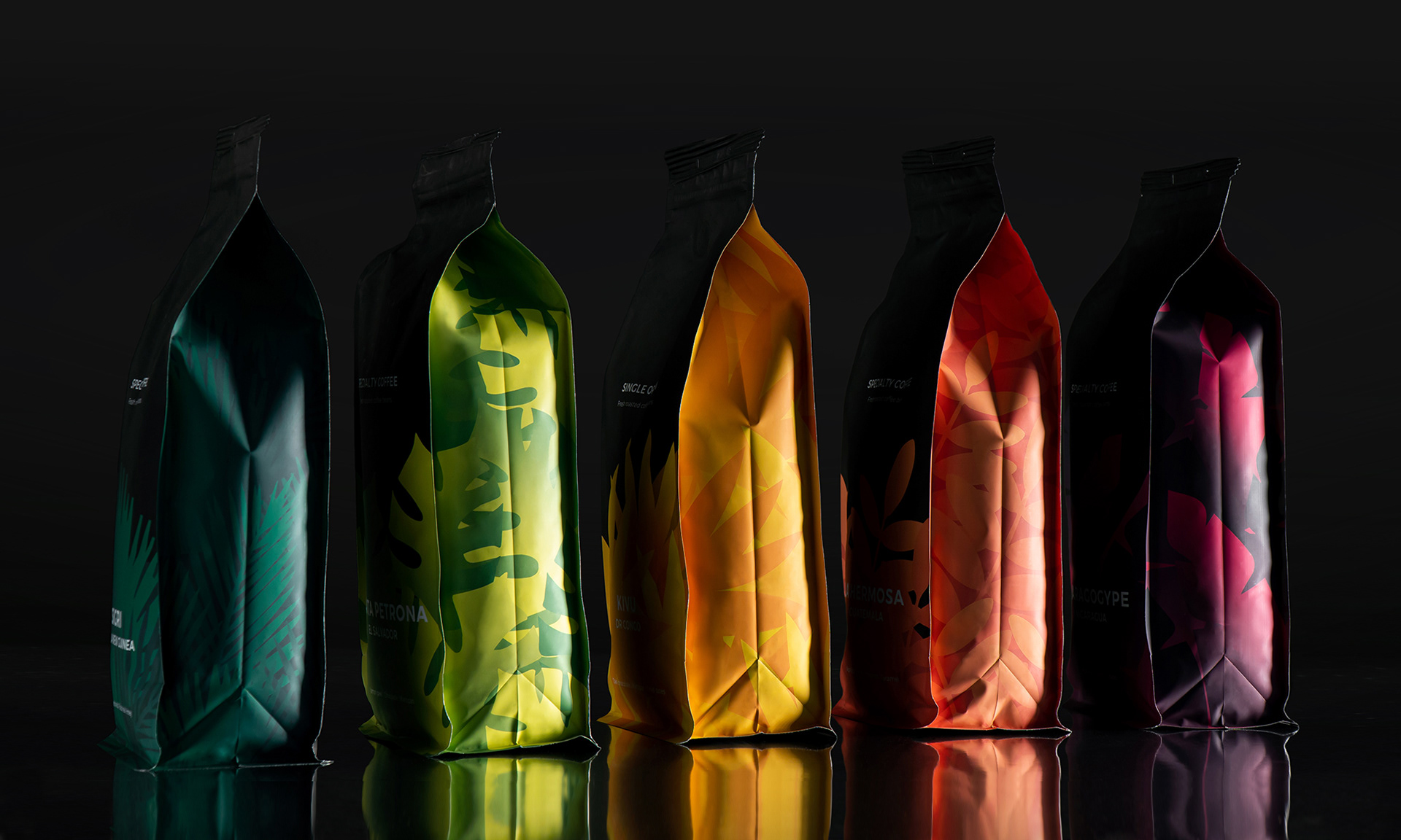
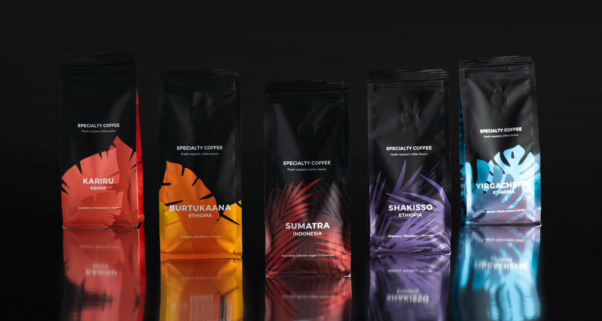
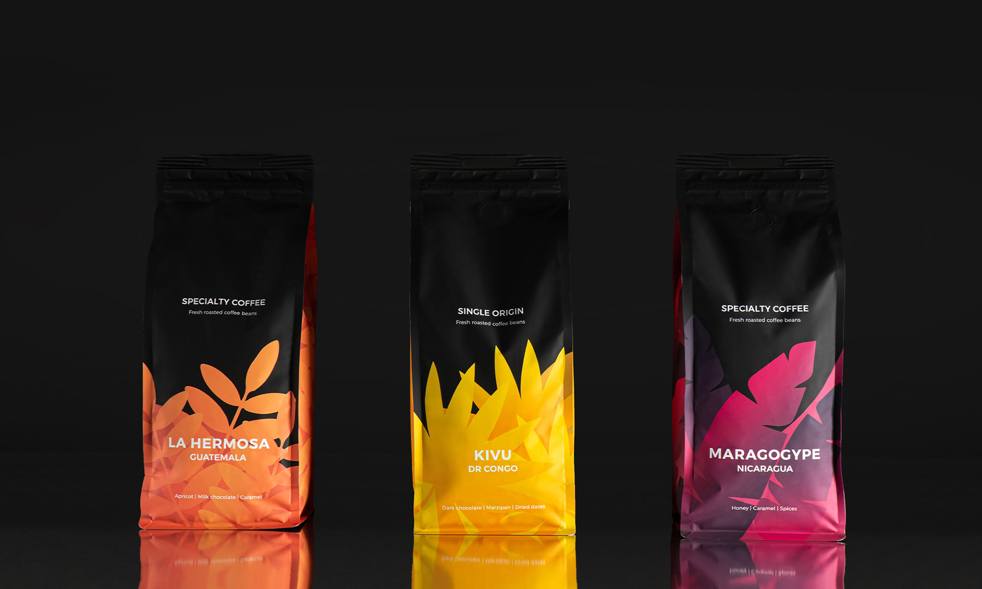
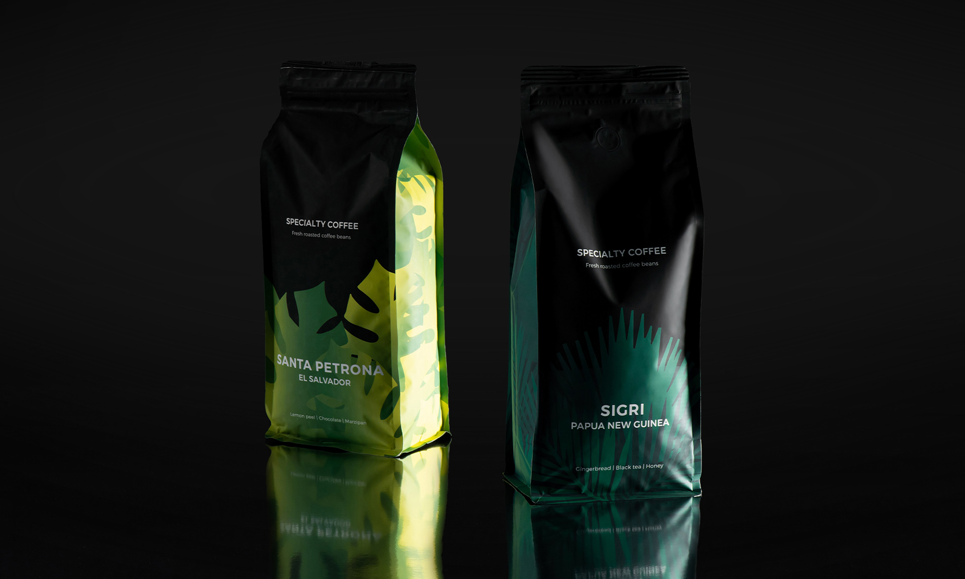
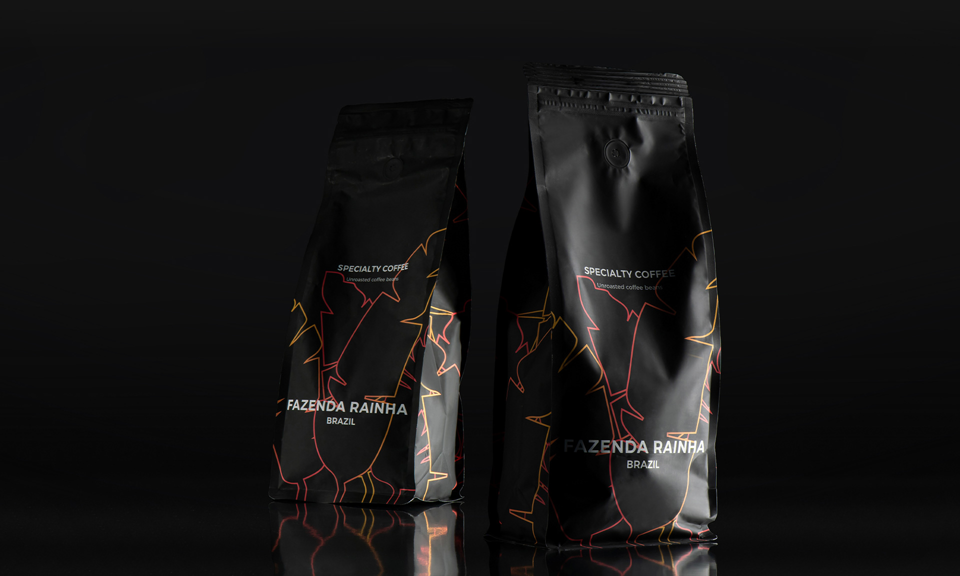
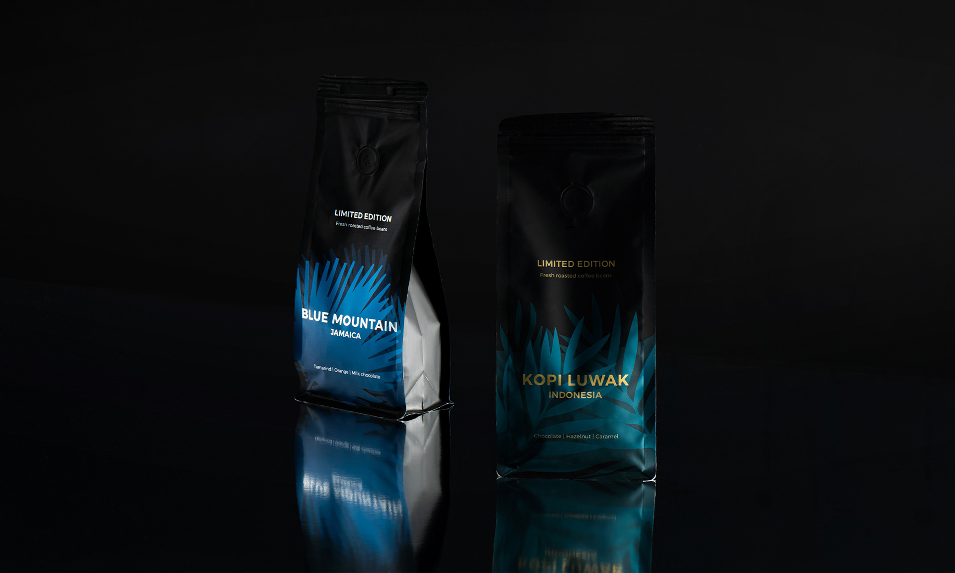
The matte black colour gives a feeling of luxury and quality. Exactly this feature usually characterises specialty coffee. The contrast between bright colours and matte black creates real harmony and a sense of trust. Combinations of different colours are used to emphasize the uniqueness of different coffee tastes. When the customer finds his favourite taste and, for example, forgets its name, he can easily identify it by the colour.
The shape and use of the packaging itself have also been improved. The bottom of the package is rectangular, it allows the package to stand firmly on a flat surface, making it look attractive on store shelves. Ziplock eases the usage and helps to preserve the aroma of coffee for a longer period of time.
Graphic elements in shades of gold and silver are used for the limited edition coffee packaging in order to make it easier for customers to distinguish this line. Also, we wanted to emphasize our unroasted coffee – its packaging reflects the motifs of the leaves found in other packages, but here they are conveyed by means of a line. In this way, it was aimed to convey the untapped potential of unroasted beans and the palette of different flavours.
‹ WHAT'S UNIQUE?
Black packaging emphasizes the uniqueness of selected leaf shapes and colours. Leaves reflect the culture of a specific coffee region, whereas the colours highlight distinctive tastes.
This coffee line does not have a common name as specialty coffee speaks for itself – each name of coffee that we used is well known and appreciated all over the world. Therefore, we believe that no additional names are needed for such a line since world-famous coffee names can be easily recognised by true coffee connoisseurs.
